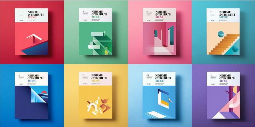
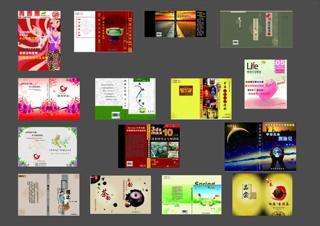
The cover of a book represents the image of the book. Only when the image of a book is good, can readers have the desire to read the book. A good book cover design can convey the ideas in the book and let the readers from the cover Design can feel the content of this book, so what are the book cover design skills? The following are 4 aspects of cover design skills for your reference.
Conceptual design of the cover:
First of all, it should be established that the form of expression should serve the content of the book, using the most touching, vivid, and visually acceptable form of expression. Therefore, the concept of the cover is very important. It is necessary to fully understand the connotation, style, and style of the manuscript. Genre, etc., to be innovative, relevant and appealing. The process and method of conception can roughly have the following methods:
1. Imagine
Imagination is the basic point of conception. Imagination is centered on the perception of styling, which can produce a clear and meaningful image. What we call inspiration is the accumulation and crystallization of knowledge and imagination. It is a source of enlightenment for design ideas.
2. Abandon
The conception process is often “easy to stack, difficult to discard”. When thinking about a lot, it is often too much to pile up, and I can’t bear to give up the extra details. Mr. Zhang Guangyu said “do more subtraction and less addition” is a real talk of experience. For unimportant and dispensable images and details, resolutely endure the pain.
3. Symbol
Symbolic technique is the most powerful language for artistic expression. It uses imagery to express abstract concepts or artistic conceptions, and abstract images can also be used to express concrete things as metaphors, which are all acceptable to people.
4. Explore and innovate
Popular forms, commonly used techniques, and cliché language should be avoided as much as possible; familiar conception methods, common composition, and habitual skills are all enemies of innovative ideas. To be innovative, you need to be unconventional and unconventional. To have innovative ideas, you must have a tireless spirit of exploration.
The text design of the cover:
Except for the title of the book, the cover text of the book cover design uses printed fonts, so here I mainly introduce the font of the title. The fonts commonly used in book titles are divided into three categories: calligraphy, art and print.
1. Calligraphy
The calligraphy style pursues endless changes between the strokes, has a strong artistic appeal, distinctive national characteristics and unique personalities, and the handwriting is mostly from the hands of celebrities, with celebrity effect, and is widely loved.
2. Art
The art style can be divided into two types: regular art style and irregular art style. The former, as the mainstream of the art style, emphasizes the regularity of appearance and uniform changes in dots and strokes. It is easy to read and easy to design, but it is relatively rigid. Irregular art is different in this respect. It emphasizes free deformation and pursues irregular changes no matter from the stroke processing or the font shape. It has the characteristics of rich changes, outstanding individuality, sufficient design space, strong adaptability and rich decoration. Compared with regular art and calligraphy, irregular art style has both personality and adaptability, so many books and magazines use this type of font.
3. Print
The printed body has followed the characteristics of the regular art body. The early printed body was relatively dull and rigid. The current printed body has made breakthroughs in this regard, absorbing the changing rules of irregular art body, greatly enriching the expressive power of the printed body, and With the help of a computer, the printing method is both convenient and rich, which makes up for its shortcomings in personality.
Some domestic books and periodicals combine Chinese and English titles in the design to form a unique decorative effect. The visual image of the journal title is not statically represented by a single font, color, and font size. Combining more than two fonts, colors, and font sizes will be refreshing.
Picture design of the cover:
The picture on the cover has become an important part of the design element because of its intuitive, clear, strong visual impact and easy to resonate with readers. The content of the pictures is rich and colorful, the most common ones are people, animals, plants, natural scenery, and the products of all human activities.
Picture is an important part of book cover design. It often occupies a large area in the picture and becomes the visual center, so picture design is particularly important. Generally, youth magazines and women’s magazines are leisure books and periodicals. Their standard is public aesthetics. They usually choose pictures of popular film and television stars and models as their covers; the standard for selecting pictures of popular science publications is knowledge, and they often choose nature-related and advanced pictures. The pictures of scientific and technological achievements; while sports magazines choose pictures of famous sportsmen and sports scenes; news magazines choose news figures and related scenes. Its standard is neither young beauty nor scientific knowledge, but news value; covers of photography and fine arts publications Choosing excellent photography and art works, its criterion is artistic value.
The color design of the cover:
The color treatment of the cover is an important part of the design. Appropriate color performance and artistic treatment can produce eye-catching effects in the reader’s vision. The use of color should consider the needs of the content, and use the contrast effect of different colors to express different content and ideas. Seek unified coordination in the contrast, it is advisable to configure the colors with each other, so that the contrasting colors are unified in coordination. The color of the title must have a certain weight on the cover. If the purity is not enough, it will not produce a significant eye-catching effect. In addition to painting colors for the cover, decorative colors can also be used. The cover colors of literary books are not necessarily suitable for textbooks, and the cover colors of textbooks and theoretical works are not suitable for children’s books. To treat the meaning of color dialectically, it cannot be used metaphysically.
In addition to coordinating the color configuration, it is also necessary to pay attention to the contrast relationship of colors, including hue, purity, and brightness contrast. If there is no contrast between hue and warmth on the cover, you will feel lack of vitality; if there is no contrast of lightness and depth on the cover, you will feel dull and breathless; if there is no contrast of purity on the cover, you will feel old and flat. We must grasp the relationship between brightness, purity, and hue in the cover color design, and use these three relationships to understand and find the causes of the defects on the cover in order to improve color cultivation.


There are many techniques for book cover design. As a book printing manufacturer, we have a professional design team, if you have any ideas, please tell us, our designers can design a special book cover that you are satisfied with.


